A table chart is a graphical representation of data or information organized in rows and columns. It is an effective way of displaying data in organized manner.

How to proceed?
Step 1
Launch power BI desktop app and open the new report page and import the data required.
Refer Lesson 7 - Power BI Datasets to build great visuals
Step 2
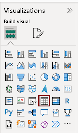
In “visualizations” pane click on “Table chart” which is highlighted in the given figure.
Step 3
Drag the data fields into “Field Section “that you want to analyze using the Table chart.
Column- Specific type of information or data attribute you want to display. It determines the type of information to be organized into table’s column.
In this demo, I dragged participants name, country which they belong to and the number of gold medals they won in 120 years of Olympic history.
The table chart displays all the participants name who won gold medal. In order to display top 15 participants who won most gold medals apply filters.
Step 4
Filters are used to display selective data based on specific criteria or conditions, making your data analysis more focused and meaningful.
Here, I applied filters to show only gold medals in the "Medal" field and used a "Top N" filter on the "Name" field to display the top 15 participants in a table chart.
The "By Value" option in a filter enables you to set filter conditions by directly specifying particular values from a column or field in your dataset. This table chart displays the top 15 participants based on the count of gold medals won, with the count of medals serving as the filtering criterion.
Step 5
Customizing the appearance of Table chart
The "Grid" option in the Format Pane allows you to control the appearance of gridlines within the table.
Gridlines are the horizontal and vertical lines that separate cells in the table. You are allowed to adjust the width and color of the gridlines.
Border- The "Section" in the border option determines where the border lines should appear within the table. This option includes Column header, Value section, Total section.
The "Border" option also includes settings for defining the position, color, and width of the lines appear in the table chart.
Additional formatting options for the table chart encompass various aspects such as customizing column headers, managing totals, adjusting specific column cell elements, incorporating URL icons, controlling image sizes, and ensuring accessibility features.
Step 6
Save the visual
Finally, your Table chart is ready. Click save button to save the visual.
When to use Table chart?
You can use Table chart for following scenarios.
- Table charts are used to display detailed information such as customer details, product details.
- Table charts enables users to sort data based on specific criteria.
- When you want to show different data types in a single visual, you can use table chart.
Pros
- Table charts neatly organize information for easy reading and clear presentation.
- Table chart can manage various types of data, including text, numbers, and dates.
- Table charts are useful for verifying and examining data for accuracy and compliance.
Cons
- Tables can be less engaging than charts or pictures and may become confusing when there's a lot of data.
- Table chart occupies lot of space. If you ae not having enough space, they might not fit well.
- For complex data with numerous columns, table charts can become overwhelming and hard to understand.
Conclusion
Table charts offers a robust way to display detailed data but are best used in conjunction with other visualizations to convey key insights effectively. Their strengths lie in data validation and comprehensive information presentation.
| Tags | Power BI |
| Useful links | |
| MS Learn Modules | |
Test Your Knowledge |
Quiz |


No comments:
Post a Comment