Doughnut chart is the data visualization which resembles a donut with a hole in center. Doughnut charts are useful in representing data with a contribution of different categories to a whole which has similar features like a pie chart but with a hole in the center.

How to Proceed?
Step 1
Launch power BI desktop app and open the new report
page and import the
data required.
Refer Lesson 7 - Power BI Datasets to build great visuals
Step 2
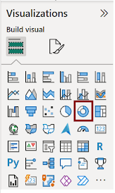
In “Visualizations” pane click on “Doughnut chart” which is highlighted in the given figure.
Step 3
Drag the data fields into “Field Section “that we want to
compare and analyze.
 Legend: It is used to label and describe the segments or slices in the donut chart, helping users to understand
What each legend represents - Sport
Values: Represents the proportions or percentage of each category relative to the whole- No of Participants
Step 4:
Filters in Power BI allows us to control and shape the data as per our needs. Here we are showing the page level filter where we can display only the data we want to show in reports or dashboards. By slicing and dicing the data we can gain insights from it. Doughnut chart: Distribution of Athetes by Sports
we used filters for Sport field to show the top 5 sport category by No of participants
Customizing the appearance of Doughnut chart
You can customize the appearance of the visual. You can change Title, Font size, Style, Colours and Data labels. Click anywhere on the visual and set the below properties in the Format section.
In this visual, I chose background colour as blue and gave 87% transparency which reduces the intensity of the colour.
Customizing legend is the key part of the Doughnut charts since it provides information about data being displayed
You can adjust the position of the legend, font size, style and colour or you can hide it if the data labels are already on the chart.
In this visual, I chose “Top Right position” to show the legend.
Slices refer to the individual segment or part of the donut chart that can be customized separately. You can give colors of your choice to each slice.
Detail Label refer to the data label which display exact value of each category.
Rotation refers to the ability to change the angle or orientation of the donut chart. Rotating a donut chart is useful for improving its visual clarity and emphasis
Here in doughnut chart, we can play with the inner circle radius under the format section of the chart.
Step 5 Save the visual
Finally, your doughnut chart is ready. Click save button to save the visual
When to use Doughnut Chart?
Doughnut charts are an appropriate choice in specific situations when you want to represent data in a circular form with a hole in the Center. Here are some scenarios in which Doughnut charts can be effectively used ,When you want to explain how different sections make up the whole thing, showing how big each section is compared to the entire thing.
Pros
- Doughnut charts provide an easy-to-understand visual representation of proportions within a whole.
- Doughnut charts effectively communicate the percentage contribution of each category to the whole.
- Doughnut charts works well when we have a small number of categories
- Doughnut charts are visually appealing and grab users’ attention.
- Doughnut charts are an alternative to pie charts when we need to avoid having a hole in the Center. This can be useful when you have limited space, as you can add additional information or labels in the Center of the chart.
Cons
- Doughnut charts won’t be suitable when there are lots of different categories, because it looks messy and hard to figure out.
- It will be bit challenging for users to compare multiple doughnut charts side by side due to varying angles and proportions.
- Adding data labels to each doughnut chart slice will lead to overcrowding and gives chaotic appearance.
Conclusion
Doughnut charts are the visual tools which present data by breaking it down into easy segments, revealing the relationship between individual parts and the whole. Their simple and engaging way of representing information makes them a popular choice for conveying the composition of a whole, especially when dealing with a limited number of categories.
| Tags |
Power BI |
| Useful links |
|
| MS Learn Modules |
|
| Test Your Knowledge |
Quiz |

 Legend: It is used to label and describe the segments or slices in the donut chart, helping users to understand


No comments:
Post a Comment